“BI (Business intelligence) is about providing the right data at the right time to the right people so they can make the right decisions.” – Nic Smith, Head of Product Marketing for Data and Analytics at Google
Business intelligence is about engaging in the tasks that result in having the right data at the right hour. It is a basic requirement from decision-makers in top companies.
Organizations today are generating a large volume of data. After collection, processing, and interpretation, this data enables the decision-makers to make the right decisions and results in business growth. The data science specialists are experts who deal with data and enable its study. Google, and Microsoft, are a few names collecting, using and interpreting big data. To understand, it is crucial to know what BI is, and the data visualization tools that can be used for it.
What are BI tools?Business Intelligence (BI) tools are software that collects, transforms and presents data to enable the firm's decision-makers improve business profitability. BI tools thus deal with a lot of structured and unstructured data from several sources. BI transforms this data and enables it to derive helpful business insights from the collected data.
Data visualization:What is the meaning of the term data visualization?
Data visualization can be described as a process by virtue, of which one creates a visual representation of the knowledge within a dataset. There are hundreds of methods by which data visualization can be achieved, but the most commonly used ones are listed below:
- Bar charts
- Pie charts
- Gantt charts
- Histograms
- Box - and whisker plots
- Heat maps
- Area charts
- Waterfall charts
- Infographics
- Scatter plots
- Maps
Why is data visualization an important area of study and work?
If the data can be visually understood, it enables better insights. Data visualization is an efficient means of making data easily accessible across a company. This also empowers the users and other employees to take actions based on concrete knowledge instead of depending on assumptions. Thus, it results in more data-based company's processes.
Data visualization also helps play a crucial role in communication with clients and parties outside of the business, like investors, media, stakeholders and regulatory agents. Data visualization has turned out to be so crucial to modern business that several companies today are specifically hiring individuals knowledgeable and intuitive in it. This is one of the important data science skills.
Top 5 BI tools creating an impact on data visualization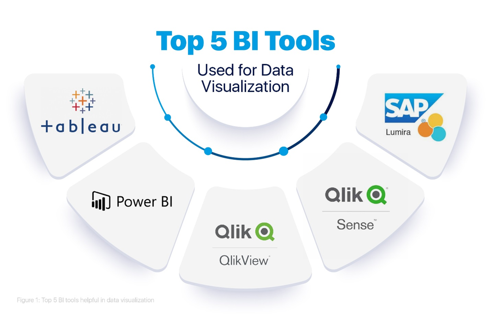
Figure 1: Top 5 BI tools helpful in data visualization
The top 5 BI tools highly sought for data science skills in data visualization are mentioned below:
1. TableauTableau is a new age business intelligence and data analytics platform.
Advantages of Tableau
- Tableau provides ease-of-use and flexibility.
- Its core strengths are its interactive dashboards, real-time data analysis provision, and quick response provision.
- It provides attention-grasping graphics (visualizations) for the pictorial representation of the data.
- Tableau offers all the essential capabilities for data extraction, data processing, presentation of data and sharing the dashboards/final reports/worksheets with other decision-makers.
- The main reason behind the popularity of Tableau is its simple drag-and-drop functionality to create visualizations.
- It has a higher speed as compared to other BI tools.
- It is incredibly intuitive, which makes it a powerful self-service tool.
- It provides connectivity to many Big Data sources like Teradata, Oracle, SAP HANA, Excel, MongoDB, JSON, Text files, Amazon Redshift, Google Cloud, Hadoop, SQL, and others.
Microsoft Power BI is a well-known and powerful data visualization tool. It is a cloud-based software and comes in two versions; Power BI Mobile and Power BI Desktop.
Advantages of Microsoft Power BI
- Microsoft Power BI is popular for its easy-to-use functionality for data visualization and data preparation.
- It comprises many visualization capabilities like creating visualizations using natural languages, custom visualizations, having Cortana personal assistant, etc.
- Microsoft Power BI provides connectivity to many data sources like IBM, Oracle, SQL Server, Google Analytics, Salesforce, Azure DevOps, Excel, JSON, text files, Mailchimp, Zendesk etc. It is also applicable for the integration with big data sources that are simple with direct connections by applying web services.
As per the Gartner Magic Quadrant statement for 2019, QlikView is one of the best BI tools.
Advantages of QlikView
- QlikView offers an in-memory storage option that makes data collection, data intetagration and data processing very quick. The reports are created by applying visualization tools, and the connectivity between data is reached automatically using the QlikView software.
- It can be said that QlikView is a data discovery tool that helps in the making of dynamic apps for the application of data analytics. It has some unique data visualization capabilities. Data Discovery can be described as a user-driven search for trends and patterns in data. It helps data scientists see and know the patterns by offering visual aids like tables, graphs, maps, etc.
- QlikView is also distinct because of its flexibility, collaborative aids, and in-memory abilities.
Qlik Sense is well-known as visualization software, and it is helpful in data analysis.
Advantages of Qlik Sense
- At the core level, it functions with an associative QIX engine. It helps the user associate and link data from various sources to carry out data analysis. It is helpful in data analytics for an extensive range of users, from technical to non-technical users.
- Qlik Sense has its focus more on data visualization because it has augmented graphics. However, in the case of QlikView, the user can manipulate data in many technical ways by using scripting. If the user's motive for using Qlik Sense is to visualize and analyze data in the best possible graphics, Qlik Sense is the right choice.
- Qlik Sense provides too much flexibility to the users as they can conduct entirely independent tasks with self-service analysis and visualizations.
- In addition to this, users can be educated by the automatic machine-guided analysis using the cognitive engine present in Qlik Sense.
- Qlik Sense offers an Associative Model that allows users to freely perform data analysis and come to data interpretation even for complex and vast data. Thereby, the users can draw intuitive insights using it.
- Integration of big data files from several sources can be done in Qlik Sense.
- It provides a platform using which clients can share data applications as well as reports on a centralized presence. They can also export structured or unstructured data stories, share with data science professionals, secure data models, etc., to multiply their business.
SAP Lumira has recently made a shift to the list of top 10 BI tools.
Advantages of SAP Lumira
- As per the Magic Quadrant for Analytics by Gartner and BI platforms 2019, SAP Lumira can be placed in the category of “visionary BI tools” having excellent capacity.
- SAP Lumira is a self-service data analytics and data visualization tool.
- It is well-known for its easy to use and intuitive capabilities.
- SAP Lumira offers interactive and rich data visualizations like graphs, tables, maps, infographics, charts, etc.
- SAP Lumira comprises two editions based on the purpose of use; a Designer edition and a Discovery edition. In the Discovery edition, the user can use self-service data visualizations and then publish the details directly on the SAP Business Objects BI tools. In the Designer edition case, the user can use self-service visualizations to create analytic applications (in complete detail).
- It is a user-friendly tool with a home screen, and it is here that all the data sources can be located.
- It has input controls for the users to work on the application freely.
- The application screen provides a single platform to create applications with imported data and perform data visualization.
- With SAP Lumira, one gets access to real-time data such as Universe data, governed data, cloud data, data from big data sources, metadata, etc.
After subjected to BI tools, the big data helps visualize the shape, importance, and recommendations from the information. Thus, the BI tools like Tableau, Microsoft Power BI, QlikView, Qlik Sense, and SAP Lumira are of great importance in the field of data visualization.