In 2025, the world generated 181 zettabytes of data annually, a staggering 23.13% year-over-year increase, with 90% of it created in just the previous two years.
Organizations capture this deluge to uncover opportunities, cut costs, and sharpen decisions. Yet, in most cases, the resulting insights remain confined to spreadsheets and dashboards, never translating into meaningful action.
The issue is understanding the difference between data visualization and data storytelling.
These two concepts are often confused, but they serve distinct purposes. Let's break down what makes them different and when to use each approach.
What is Data Visualization?
Data visualization transforms raw numbers into charts, graphs, tables, and other graphical elements that make patterns and trends easier to spot.
Key Characteristics of Data Visualization:
- Purpose: Displays information in visual formats for quick comprehension
- Focus: The "what" - showing facts, trends, and patterns
- Application: Both exploratory (finding insights) and explanatory (presenting findings)
- Elements: Charts, graphs, dashboards, tables, and visual representations
When to Use Data Visualization:
Not every data moment needs a full story. Sometimes the fastest way to get everyone on the same page is to let them see the truth instantly.
Our brains process visuals 60,000 times faster than text. That single fact explains why the right chart can replace pages of spreadsheets and still land harder.
Use visualization whenever you need to:
- Monitoring performance metrics through dashboards
- Comparing data sets across different categories
- Identifying patterns and trends in large datasets
- Tracking progress toward goals and KPIs
- Conducting exploratory analysis to discover insights
Common Data Visualization Types:
| Chart Type | Best Used For | Example Use Case |
|---|---|---|
| Bar Charts | Comparing categories | Sales by region |
| Line Charts | Showing trends over time | Revenue growth |
| Pie Charts | Displaying proportions | Market share distribution |
| Scatter Plots | Revealing correlations | Price vs. demand relationship |
| Heat Maps | Showing intensity patterns | Website user behavior |
Important Note: While visualization can tell stories at the slide level by providing context and highlighting key insights, the real magic happens when combined with narrative structure.
What is Data Storytelling?
Data storytelling goes beyond visual representation. It weaves insights into structured narratives that create emotional connections and drive specific actions. It addresses the "why" and "so what" questions that executives actually care about.
Key Characteristics of Data Storytelling:
- Purpose: Always explanatory, making specific insights clear and actionable
- Focus: The "why" and "so what" - connecting data to emotions and decisions
- Application: Only explanatory (presenting findings with context and narrative)
- Elements: Data + visuals + narrative structure
The Three Pillars of Data Storytelling:
Even the most beautiful chart falls flat without context and meaning. As Brent Dykes explains in his book "Effective Data Storytelling," successful data stories sit at the intersection of three elements:
- Data - The foundation providing credibility
- Visuals - Charts and graphics for comprehension
- Narrative - The story structure that binds everything together
When visuals and narrative reinforce each other instead of competing, insights stop being forgotten in slide decks and start changing behavior.
When to Use Data Storytelling:
Stories are most effective when you need to:
- Drive behavioral change or organizational transformation
- Secure executive buy-in for strategic initiatives
- Communicate complex insights that require context
- Present difficult or risky recommendations that need persuasion
- Make insights memorable for long-term impact
Research shows that people remember stories up to 22 times more than facts alone, making storytelling essential.
The Strategic Difference: A Side-by-Side Comparison
| Aspect | Data Visualization | Data Storytelling |
|---|---|---|
| Primary Goal | Display information visually | Drive action and change |
| Analysis Type | Exploratory and explanatory | Only explanatory |
| Engagement | Logical and analytical | Emotional and analytical |
| Memory Impact | Moderate retention | High retention (22x more memorable) |
| Time Investment | Quick to create | Requires strategic planning |
| Best For | Easy insights, monitoring | Complex insights, persuasion |
| Decision Speed | Fast data processing | Deeper understanding and commitment |
When Should You Use Each Approach?
Not every insight requires a full narrative structure. Strategic use is key.
Use Data Visualization When:
- Insights are straightforward and easy to implement
- Audience needs quick pattern recognition
- You're conducting exploratory analysis
- The data speaks for itself
- You're monitoring routine metrics
Use Data Storytelling When:
- Insights are complex or counterintuitive
- You need to change behavior or drive decisions
- Recommendations involve risk or significant investment
- Audience skepticism is expected
- The insight has medium to high value for the organization
Strategic Principle: Stories are best used for relatively difficult insights with medium to high value. High-value but easy-to-implement insights typically don't need extensive storytelling, visualization alone suffices.
Practical Steps to Get Started with Data Storytelling
Successful data storytellers always start with their audience before building charts and tables:
Step 1: Define Your Objective
- What am I trying to achieve with this data?
- What is my BIG Idea, the one thing I want my audience to know or do?
Step 2: Understand Your Audience
- Who are they and what do they care about?
- What level of detail will they expect or appreciate?
- What motivates their decisions?
Step 3: Structure Your Narrative
- Choose appropriate story structure (problem-solution-benefit, past-present-future, etc.)
- Identify which data supports your story
- Remove any extraneous information
Step 4: Create Compelling Visuals
- Keep visualizations simple and focused
- Use pre-attentive attributes (color, size, position) to guide attention
- Create headlines for every slide
- Include call-outs to highlight critical data
Step 5: Test and Refine
- Does each data point move your story forward?
- Have you minimized noise and maximized signal?
- Is your call-to-action clear?
Common Data Visualization Mistakes
Even experienced professionals fall into predictable traps when working with data. Recognizing these mistakes is the first step toward creating more impactful data communications.
Poor visualization choices can confuse your audience, erode trust, and obscure the insights you've worked hard to uncover. Here are the critical mistakes to avoid:
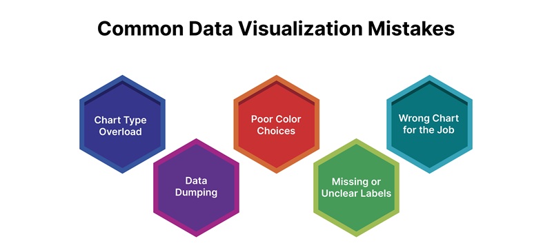
1. Chart Type Overload
The Mistake: Using too many different chart types in a single presentation creates visual chaos and cognitive overload.
The Fix: Stick to 2-3 chart types throughout your presentation. Consistency helps your audience quickly understand each visualization without having to relearn visual conventions.
2. Data Dumping
The Mistake: Including excessive data that obscures key insights. When you show everything, you highlight nothing.
The Fix: Be ruthlessly selective. Only include data that directly supports your main points. Your job is to simplify, not to prove you analyzed a lot of data.
3. Poor Color Choices
The Mistake: Using colors that reduce readability, whether through insufficient contrast, too many competing colors, or culturally inappropriate choices.
The Fix: Use color strategically and sparingly. Highlight only what matters most. Ensure sufficient contrast for accessibility. Test your colors in grayscale to verify they work for colorblind audiences.
Also Read: The Role of Color in Dаtа Visuаlizаtion
4. Missing or Unclear Labels
The Mistake: Leaving out axis labels, units of measurement, or time periods, forcing your audience to guess what the data represents.
The Fix: Always include clear, concise labels. Your audience should never have to ask "What does this number mean?" or "What time period is this?"
5. Wrong Chart for the Job
The Mistake: Choosing inappropriate chart types for your data (like using a pie chart for time-series data or a line chart for categories).
The Fix: Match your chart type to your data structure and the story you're telling. Use bar charts for comparisons, line charts for trends, and scatter plots for correlations.
Common Data Storytelling Mistakes
While storytelling adds power to your data, these common mistakes can drain that power away:
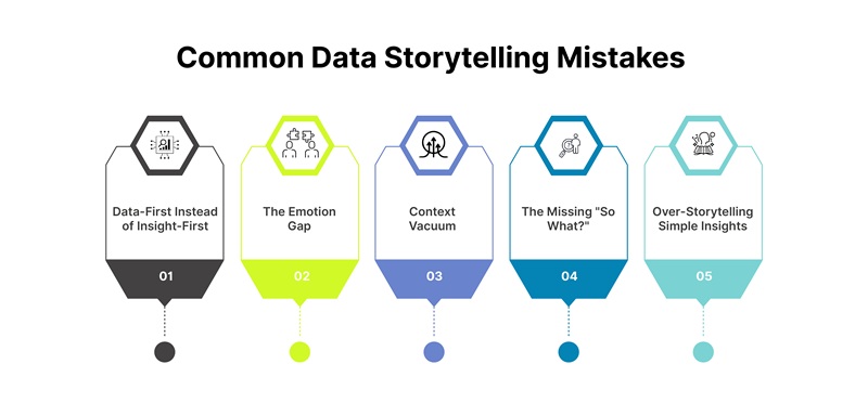
1. Data-First Instead of Insight-First
The Mistake: Building stories around your data rather than around the insights that matter to your audience. This creates presentations that feel like "here's what I found" instead of "here's why you should care."
The Fix: Start with the insight, not the data. Ask yourself: "What's the one thing I need my audience to remember?" Build your story around that single, powerful insight.
2. The Emotion Gap
The Mistake: Neglecting the emotional element and assuming facts will speak for themselves. This ignores how humans actually make decisions.
The Fix: Connect your data to human impact. Show how the numbers affect real people, customers, employees, stakeholders. Make your audience feel something, not just understand something.
3. Context Vacuum
The Mistake: Failing to provide sufficient context and jumping straight to conclusions without establishing baselines, explaining what's normal, or showing why something matters.
The Fix: Always set the stage. Establish what "normal" looks like before revealing what changed. Explain why your audience should care before diving into the details.
4. The Missing "So What?"
The Mistake: Presenting insights without a clear call-to-action, leaving your audience thinking "That's interesting, but now what?"
The Fix: Every data story needs a resolution. Explicitly state what you want your audience to do with this information. Make your recommendations specific and actionable.
5. Over-Storytelling Simple Insights
The Mistake: Using elaborate narrative structures for straightforward insights that don't require persuasion. This wastes time and reduces impact.
The Fix: Reserve storytelling for complex, high-value insights that need persuasion. For simple, obvious insights, stick with clean visualization and brief explanation.
The Bottom Line
Data visualization and data storytelling are complementary tools that serve different purposes:
- Data visualization = Showing the "what" through visual representation
- Data Storytelling = Explaining the "why" and "so what" through narrative structure
The most successful data communicators master both approaches and know when to deploy each one. They recognize that while visualization helps us process information quickly, storytelling helps us remember it, believe it, and act on it.
Remember that every piece of data you include should serve a purpose. If it doesn't further your message, leave it out. Your goal isn't to show all the data you've gathered, it's to communicate insights that drive action.
Start by asking yourself: "Will this help my audience make a better decision?" If the answer is yes, you're on the right track.


