In data science, building a machine learning model is only half the battle. The real challenge lies in understanding whether that model actually works well. Many data scientists make the critical mistake by focusing solely on accuracy when evaluating their models. This narrow view can lead to poor decisions and unreliable predictions in real world applications.
This article will guide you through the complexity of model evaluation, showing why accuracy alone isn’t enough and exploring better ways to judge a model’s success. Let’s dive in and learn how to evaluate models the right way!
The Hidden Dangers of Accuracy
Accuracy measures how often a model makes correct predictions overall. While this sounds useful, it presents a dangerously simplified view of model performance. Accuracy fails to delve into intricate details that can significantly impact a model's effectiveness, and blindly trusting it may lead to misguided conclusions, particularly in scenarios where false positives or false negatives carry varying consequences.
Consider a medical diagnosis system designed to detect a rare disease that affects only 1% of the population. A model that simply predicts "no disease" for every patient would achieve 99% accuracy. Yet this model is completely useless because it never identifies the patients who actually need treatment. This example shows why model evaluation in data science requires looking beyond surface level metrics.
Building a predictive model is not the motive but about creating and selecting a model which gives high accuracy on out-of-sample data. This means we need evaluation methods that reveal how well a model will perform on new, unseen data rather than just the training set.
Understanding Precision and Recall
When working with classification problems, two fundamental data science metrics emerge: precision and recall. These metrics provide different perspectives on model performance that accuracy cannot capture.
Precision measures the accuracy of positive predictions, focusing on minimizing false positives, while recall gauges the model's ability to capture all relevant instances, emphasizing the reduction of false negatives. Understanding when to prioritize each metric depends entirely on your specific use case.
For instance, a spam email filter prioritizes precision. You want to make sure that emails marked as spam are actually spam because false positives mean important messages end up in the trash. However, a disease screening test prioritizes recall. Missing a positive case (false negative) could have serious health consequences, so you want to catch as many true cases as possible, even if it means some false alarms.
Achieving a balance between precision and recall is crucial, as optimizing one often comes at the expense of the other. This inherent tension creates what experts call the precision recall trade-off
The F1 Score: Balancing Two Priorities
When you need both precision and recall to be strong, the F1 score becomes invaluable. The F1 score takes the harmonic mean of precision and recall, offering a compromise that is particularly valuable when a balanced approach to positive predictions and capturing all relevant instances is essential.
Why use a harmonic mean instead of a simple average? The harmonic mean punishes extreme values more. If a model has perfect precision but zero recall, a simple average would give 0.5, suggesting mediocre performance. The harmonic mean gives 0, correctly indicating that the model is useless.
The F1 score becomes especially relevant in scenarios where false positives and false negatives have different consequences. This makes it a robust metric for tasks where you cannot afford to sacrifice either precision or recall completely.
For situations where you want to weight precision or recall differently, you can use the F beta score. This variant allows you to adjust how much importance you place on recall versus precision, giving you flexibility based on your specific business or research needs.
The Confusion Matrix: Your Evaluation Foundation
A confusion matrix is a table with 4 different combinations of predicted and actual values and is extremely useful for measuring precision, recall, specificity, accuracy, and most importantly, AUC ROC curves.
The confusion matrix displays four critical values:
- True Positives: Correctly predicted positive cases.
- True Negatives: Correctly predicted negative cases.
- False Positives: Incorrectly predicted positive cases (Type 1 errors).
- False Negatives: Incorrectly predicted negative cases (Type 2 errors).
For example, consider a spam email detection system. If the model correctly identifies 80 spam emails as spam (True Positives) and 90 regular emails as not spam (True Negatives), it performs well. However, if it mistakenly labels 10 regular emails as spam (False Positives), causing users to miss important messages, or misses 20 spam emails (False Negatives), letting harmful content through, these errors highlight areas for improvement. This example shows how the confusion matrix helps evaluate model performance in real-world scenarios.
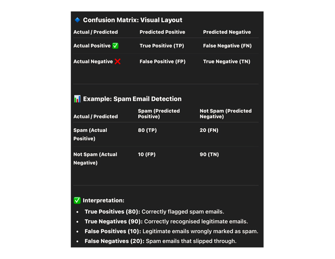
Drawing conclusions based on a single metric can be misleading, so a confusion matrix helps see the big picture by visualizing whether all classes have been covered and how well a classification algorithm performs within each.
Confusion matrices are generally used only with class output models, meaning they work best when your model produces definite class predictions rather than probabilities.
From the confusion matrix, you can calculate additional important metrics:
- Sensitivity: Sensitivity measures the proportion of actual positive cases correctly identified. In a medical test, this tells you how good the test is at catching people who have the disease.
- Specificity: Specificity measures the proportion of actual negative cases correctly identified. This tells you how good your model is at correctly identifying cases that do not belong to the positive class.
In a pharmaceutical company, they will be more concerned with minimal wrong positive diagnosis, hence they will focus on high specificity, while an attrition model will be more concerned with sensitivity.
ROC Curves and AUC: Visualizing Performance
The Receiver Operating Characteristic curve (ROC) provides a powerful way to understand model performance across different classification thresholds. ROC curves visualize the trade-off between true positive rate (sensitivity) and false positive rate across various classification thresholds.
The ROC curve is the plot between sensitivity and one minus specificity, where one minus specificity is also known as the false positive rate. As you adjust the threshold for classifying something as positive, both sensitivity and specificity change, tracing out a curve.
The Area Under the Curve (AUC) summarizes this curve into a single number. AUC quantifies the overall performance of the model, with a higher AUC indicating superior discrimination between classes.
The AUC interpretation follows these thumb rules: 0.90 to 1.0 is excellent, 0.80 to 0.90 is good, 0.70 to 0.80 is fair, 0.60 to 0.70 is poor, and 0.50 to 0.60 is fail.
One major advantage of ROC and AUC is their stability. The ROC curve is almost independent of the response rate because it has two axes coming out from columnar calculations of the confusion matrix. This means if your dataset's class distribution changes, the ROC curve remains relatively stable, unlike metrics such as lift that depend heavily on response rates.
Beyond Binary Classification: Multiclass Challenges
Multiclass classification introduces a different set of challenges compared to binary classification, and micro and macro averaging techniques emerge as solutions to address complexities arising from diverse class distributions.
Micro averaging aggregates performance metrics across all classes, treating each instance equally, while macro averaging calculates metrics for each class independently and then averages them. Each approach serves different purposes.
Micro averaging is effective for imbalanced datasets, as it emphasizes performance across all instances, giving greater weight to the larger classes for a more balanced evaluation. Macro averaging treats all classes equally regardless of size, which is useful when you want to ensure your model performs reasonably well across all categories, not just the most common ones.
Cross Validation: The Gold Standard for Generalization
Cross validation stands out as a crucial technique in mitigating overfitting concerns, which occurs when a model performs exceptionally well on training data but fails to generalize to new, unseen data.
The most common approach is K-fold cross validation. In K-fold cross validation, the entire population is divided into equal samples, and models are trained on some samples while validating on others, with this process repeated so each sample serves as validation.
Generally, a value of k equals 10 is recommended for most purposes. This provides a good balance between computational cost and reliable performance estimates.
K-fold cross validation is widely used to check whether a model is an overfit or not, and if performance metrics at each of the k times modeling are close to each other with a high mean metric value, the model is reliable.
The beauty of cross validation lies in its efficiency. Cross validation gives a way to use every single data point, which can reduce selection bias to a good extent. Instead of setting aside a large chunk of data just for validation, you use all your data for both training and validation through the folding process.
Log Loss: Accounting for Prediction Confidence
While AUC considers predicted probabilities, it only looks at their relative ordering. Log loss takes into account the model's capability to predict higher probability for samples more likely to be positive.
Log loss is the negative average of the log of corrected predicted probabilities for each instance. This metric penalizes confident wrong predictions more heavily than tentative wrong predictions.
The lower the log loss, the better the model, though there is no absolute measure of good log loss as it is use case dependent. Unlike AUC which has clear benchmark ranges, log loss interpretation requires comparing across different models for the same problem.
If you plot log loss against predicted probability, you get a gentle downward slope towards the right as predicted probability improves, but moving in the opposite direction, log loss ramps up very rapidly as predicted probability approaches zero. This characteristic makes log loss particularly sensitive to very wrong predictions.
Specialized Metrics for Business Applications
This section explores key metrics such as gain and lift charts, Kolmogorov-Smirnov (K-S) charts, Gini coefficient, and concordant-discordant ratio, which help assess how well models predict and rank outcomes. These tools provide deeper insights into model performance.
Gain and Lift Charts
Gain and lift charts are mainly concerned with checking the rank ordering of probabilities and are widely used in campaign targeting problems. These charts help businesses decide which customers to target in marketing campaigns.
The process involves ranking all predictions by probability, dividing them into deciles, and calculating response rates for each group. Gain and lift charts tell you to which decile you can target customers for a specific campaign and how much response you expect from the new target base.
A good model shows high lift in the top deciles, meaning the highest ranked predictions contain a much higher proportion of positive cases than the overall population. Any model with lift at decile above 100% till minimum 3rd decile and maximum 7th decile is considered a good model.
Kolmogorov Smirnov Chart
The K S chart measures the degree of separation between positive and negative distributions. This metric specifically evaluates how well your model separates the two classes.
The K S is 100 if the scores partition the population into two separate groups where one group contains all positives and the other all negatives, while if the model cannot differentiate between positives and negatives, the K S would be 0.
The K S statistic finds the point of maximum separation between the cumulative distributions of positive and negative cases. a higher K S value indicates better discrimination capability.
Gini Coefficient
The Gini coefficient can be derived straight away from the AUC ROC number using the formula: Gini equals 2 times AUC minus 1. This provides an alternative way to express discrimination ability.
Gini above 60% is considered a good model. The Gini coefficient essentially measures the area between the ROC curve and the random model line, normalized by the total area available above that line.
Concordant Discordant Ratio
The concordant discordant ratio is one of the most important evaluation metrics for classification prediction problems. It evaluates whether your model ranks positive cases higher than negative cases.
The concept is straightforward: take all possible pairs of one positive and one negative case. a concordant pair is where the probability of the responder was higher than the non responder, while a discordant pair is where the vice versa holds true.
A concordant ratio of more than 60% is considered a good model, and this metric is primarily used to assess the model's predictive power rather than making decisions like how many customers to target.
Regression Model Evaluation
For regression problems where you predict continuous values rather than categories, different evaluation metrics apply.
Root Mean Squared Error
RMSE is the most popular evaluation metric used in regression problems and follows an assumption that errors are unbiased and follow a normal distribution.
The squared nature of this metric helps deliver more robust results which prevent canceling positive and negative error values, and it aptly displays the plausible magnitude of the error term.
However, RMSE is highly affected by outlier values, so you should remove outliers from your dataset prior to using this metric. Additionally, as compared to mean absolute error, RMSE gives higher weightage and punishes large errors.
Root Mean Squared Logarithmic Error
In RMSLE, we take the log of predictions and actual values, and this metric is usually used when we don't want to penalize huge differences in predicted and actual values when both are huge numbers.
The behavior of RMSLE varies based on the magnitude of values: if both predicted and actual values are small, RMSE and RMSLE are the same; if either is big, RMSE is greater than RMSLE; if both are big, RMSE is much greater than RMSLE which becomes almost negligible.
R Squared and Adjusted R Squared
R Squared measures how good our regression model is compared to a very simple model that just predicts the mean value of the target from the train set as predictions.
A model performing equal to the baseline would give R Squared as 0, while the best model with all correct predictions would give R Squared of 1.
The challenge with regular R Squared is that adding any feature, even useless ones, will either increase it or keep it the same. Adjusted R Squared solves this by taking the number of features into account. If adding a feature doesn't improve the model, adjusted R squared will actually decrease, helping you avoid overfitting.
Advanced Techniques for Robust Evaluation
Advanced techniques take model evaluation to the next level, ensuring robustness and reliability in dynamic environments. This section covers ensemble methods, continuous monitoring, and additional tools like Cohen's Kappa Score, Matthews Correlation Coefficient, and Brier score. These approaches enhance accuracy, adapt to changes, and provide deeper insights.
Ensemble Methods
Ensemble methods mark a paradigm shift in model evaluation by advocating the combination of multiple models to enhance reliability through diversity.
By aggregating predictions from multiple models, ensemble methods aim to provide more accurate and stable representation of underlying patterns in the data, which is particularly beneficial when dealing with complex and noisy datasets.
Different ensemble techniques like bagging and boosting each offer unique ways to harness diversity. The key insight is that by combining multiple models with different strengths and weaknesses, you can often achieve better performance than any single model alone.
Continuous Monitoring
Model evaluation is not a one time event but an ongoing process that requires continuous monitoring, as model decay means performance may deteriorate over time due to changes in underlying data distribution or other external factors.
Continuous monitoring involves regularly updating and re evaluating models to detect and address any degradation in performance. This proactive approach ensures models adapt to evolving datasets, emerging patterns, and shifting contextual factors.
In production environments, data distributions can change gradually or suddenly. Customer behavior shifts, market conditions evolve, and new patterns emerge. Without continuous monitoring, a model that performed excellently at deployment can become increasingly unreliable over time.
Additional Evaluation Tools
- Cohen's Kappa Score: Cohen's Kappa Score shows how much two raters agree on their classifications, taking into account the chance that some agreement could happen randomly, making it more reliable than just looking at simple percentage agreement.
- Matthews Correlation Coefficient: The Matthews Correlation Coefficient gives a more balanced view than simple accuracy and is especially handy in case of unbalanced datasets. It considers all four values in the confusion matrix and produces a single score between negative 1 and positive 1, where 1 represents perfect prediction, 0 represents random prediction, and negative 1 represents total disagreement.
- Brier Score: The Brier score measures the accuracy of probabilistic predictions by looking at the difference between predicted probability and actual result, squaring that difference and averaging across all predictions. The score ranges from 0.0 to 1.0, with 0.0 meaning perfect predictions and 1.0 meaning completely wrong predictions.
Choosing the Right Evaluation Metrics
The evaluation metrics you choose should align with your specific goals and constraints. Ask yourself:
- What is the cost of different types of errors? If false positives and false negatives have vastly different consequences, precision and recall matter more than accuracy.
- Do you have imbalanced classes? Metrics like F1 score, AUC, and Matthews Correlation Coefficient handle imbalance better than accuracy.
- Are you making probabilistic predictions? Log loss and Brier score evaluate probability calibration, not just classification accuracy.
- Do you need to explain results to non technical stakeholders? Simpler metrics like precision, recall, and lift charts often communicate better than complex ones.
- Is your model for deployment or research? Production models need continuous monitoring and metrics that detect degradation, while research models might focus more on comparative performance.
Conclusion
The complexity of model evaluation in data science extends far beyond simple accuracy scores. While accuracy provides a quick snapshot, it often masks critical issues that could make your model unreliable or even harmful in real world applications.
By understanding and applying the diverse range of evaluation metrics covered here, from precision and recall to ROC curves, from cross validation to specialized business metrics, you can develop a nuanced understanding of model performance. This comprehensive approach to model performance assessment ensures your models not only perform well statistically but also meet practical business needs and ethical standards.
In an ever evolving field, adopting nuanced evaluation methodologies becomes not just a best practice but a necessity for staying ahead and constructing models that withstand the test of time. The investment in thorough evaluation pays dividends through more reliable predictions, better business outcomes, and models that truly serve their intended purpose.
Remember that no single metric tells the complete story. The art of model evaluation lies in selecting the right combination of metrics for your specific situation and interpreting them together to make informed decisions about model quality and deployment readiness.


