What is data literacy?
The ability of an organization's employees to be able to understand data to a required degree. It can be a way to progress or a roadblock in the process of building a data-driven enterprise.
Why does it matter?
Data literacy is now a sought-after ability for many professionals. To begin, leaders must be aware of data literacy and develop a common language for learning.
A Gartner survey of chief data officers found that poor data literacy is one of the top three barriers in building strong data and analytics teams. In contrast, a data literacy survey conducted by Accenture of over nine thousand employees working in various positions found that just 21% of them were confident about their knowledge of data literacy.
Data Literacy - What does it mean for YOU?
It is important to know what data literacy is & even more important is to acknowledge that it is different for everyone.
Professor Catherine D'Ignazio(MIT) and research scientist Rahul Bhargava MIT report data literacy as the ability to:
-
Read data, that is, understand how data works and what aspects of the world it covers.
-
Work with data that includes the creation, acquisition, cleaning, and management.
-
Analyze data, including sorting, filtering, aggregating, comparing, and performing various other analytical processes on it.
-
Argue using data, that is, using data to help support a bigger narrative intended to convey a message or storyline to a certain target audience.
To be considered proficient in data, "you have to be verbally literate, numerically literate, and graphically literate," Kazakoff stated.
Data literacy is considered to be one of the most challenging skill sets to build for organizations. It requires people to master a set of foundational skills that haven't always been taught together while performing at a high level.
Graphic literacy particularly, the ability to understand the visual representation of data, is fairly recent.
"You can't assume all that training has been part of people's formal education."
Data literacy also refers to the ability to go beyond analysis to share information with others effectively. "Saying data literacy is just about the analysis and not about the communication is like saying that literacy is just about reading and not about writing," he stated. But not everyone within an organization should be a data scientist. Different positions in different organizations require different levels of data literacy.
What should a data literacy plan include?
There's no definitive method for establishing the ability to use data. However, experts suggest a few essential steps.
The majority of companies follow the three steps of creating goals for data literacy and assessing the level of proficiency, and then establishing suitable learning paths. This is not a universal guideline but rather a more corporate trend.
A good data literacy program should include:
1. Differentiate between technical and data literacy.
Companies have been spending too much time training employees using technology tools that are difficult to use instead of focusing on data. If you're spending 80% on technology, 20% on data, flip it -- make the technology super easy so that you can spend more time on data."
2. Begin with a baseline of employee capabilities.
Developing data literacy begins with having a good understanding of existing skills and agreeing on the degree of competency for different jobs, Howson said. Then, companies can create a plan on how to improve the skills of employees
Businesses collaborate with businesses where employees are required to assess their data literacy to determine their proficiency level in an assessment of their analytics maturity.
3. Use common language.
Utilizing jargon or terms that are not precise can lead to confusion and can make the communication of data complicated.
Create a standard way of addressing data within the company,
For instance, analysts working with marketers may collaborate on a project that aims to increase ROAS (return on advertising spend); however, if marketers aren't aware of the concept, they may not get the most accurate data.
"Establishing a common vocabulary is vital to establish the culture of data.
It's a civilization that has a language. If you don't have a language and civilizations aren't functioning, they won't exist."
4. Create a culture of learning and encourage curiosity.
The leaders should promote an environment that encourages curiosity rather than punishing the ignorance of data. "There should be a culture of continuous learning and improvement rather than of fear. If employees feel ashamed that they're not data-literate it might affect their morale.
No one wants to be considered dumb. Therefore, there must be an environment of continual learning, where curiosity is encouraged."
If data shows some negative information, that shouldn't be used to penalize employees.
Face the harsh realities of the negative data and gain from it. If punishment is the primary response, people are inclined to cover up the information or alter it using vanity metrics. That's another part of the culture that is vital.
5. Be aware that every person learns differently.
Not everyone is ready for an hour-long training class -Some employees are better at learning through hands-on activities, and others prefer self-guided courses. "Not everyone learns the same way, so building those workshops, skills, or enablement has to be continuous and right-sized, and [in] the right medium,"
6. Define the term "success."
Without metrics to assess the effectiveness, it's difficult to determine if the initiatives to improve data literacy are working.
Literacy training should be paired by incorporating hands-on, high-value activities that have measurable performance indicators. If you don't consider the success indicators, you're not likely to see the desired outcomes.
This makes data literacy not just a desirable ability to possess. It's a factor that can drive outcomes. The most common mistake that organizations make is not thinking about the potential that data literacy can bring. This project could generate millions of dollars in your direction on the first day,
7. Make sure that leaders are involved.
Experts in data have said that the chief executives of data tend to be the ones who are in charge of literacy programs. However, every top executive must be in the loop and model the desired outcomes.
"If you’re not able to be data-driven & hold your team accountable, the data-driven approach is not going to flow down. Leadership is key. Data literacy initiatives shouldn't be initiated without executives being an integral part of the program."
Ways to ingrain data literacy in your organization
25 years back, data visualization was a niche specialization. However, things have changed, even over the past two years. Data Visualization officially broke the mainstream in the year 2019, according to Elijah Meeks, former executive director of the Data Visualization Society. The year before, it was at the degree of public fascination.
In light of this it's easy to ask what is the status of data-visualization literacy now?
Shander's response, in one word, "NO”.
The awareness and the exposure of people have increased. However, brand new people generally do not feel confident about their abilities to convey information visually.
Furthermore, he added that the gap is still as wide as it ever was.
Steve Wexler, founder of the data viz and dashboard company Data Revelations and author of The Big Picture: How to Use Data Visualization to Make Better Decisions -- Faster, has noticed an identical phenomenon in his seminars. Data visualization is certainly going faster than others in the curriculum for data literacy -- "It's hard to get people to have a visceral impact about data governance," he said. However, the extent that people are underprepared is something that astonishes him. Sometimes it even has a touch of stubbornness.
"The number of people still clinging to spreadsheets amazes me," he added. However, the benefits aren't just theoretical. The Big Picture, for example, has a lengthy list of businesses that have witnessed tangible improvements in their bottom line through more deliberate visualization strategies in fields that range from pharmaceutical development to facility management. Many of those success stories depend on spreading the benefits of data visualization as completely as possible.
"I just can't see an organization not benefiting from people having a minimal fluency in this language -- and it just isn't that hard to achieve that fluency," Wexler quoted.
With this in mind, here's a couple of tips provided by Shander and Wexler on how to start establishing the idea of a data-viz-friendly innovating culture within your business.
6 STEPS TO ORGANIZATIONAL DATA-VIZ LITERACY:
-
Make people aware of "gateway" visualizations.
-
Find a balance between complexity and simplicity.
-
Explain (a little) about the cognitive process.
-
Understanding intentional choices.
-
Use colors to teach caution.
-
Consider a data-visualization style guide.
1) Make people aware of "gateway" visualizations.
When Wexler complains about the spreadsheet enthusiasts, he's not necessarily judging the software. (One can make beautiful, useful charts in Excel, however, obviously.) Instead, it's the tendency to believe in the notion that "just the numbers" will always suffice.
If you're one of them, Wexler suggests focusing on two visualization methods that can serve as efficient "gateways" to a greater degree of data-viz confidence: highlight tables & marginal histograms. Wexler believes them because they add visual elements into the spreadsheet, allowing the spreadsheet enthusiasts to have their way.
Highlight tables are color-coded cells that show both lower and higher values in an opportune moment.
Below are two images from the exact table taken from one of his presentation. Here's what it looks like before
And here’s the same chart, with highlight tables added.
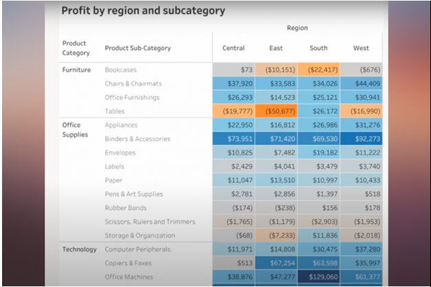
The illustration that makes use of highlight tables allows viewers to comprehend the highest and lowest values quickly and provides context for every value on the spectrum of high, moderate, and low.
The 2nd "gateway" is the marginal histogram. Marginal histograms are exactly as their name suggests: graphic summaries of data, placed within the margins of the chart or graph. As Wexler said in 2017: Marginal histograms are typically employed in scatterplots but can also be useful with highlight tables. In this case, they offer at-a-glance totals for columns and rows. Furthermore, they demonstrate the value of visual representation versus traditional crosstabs. They also provide an easy on-ramp for using basic visual elements in the storytelling of data.
2) Find a balance between complexity and simplicity.
Any effort to increase the literacy of data visualization will require an overview of different visualization styles. Many high-quality catalogs can be used (like Data Visualization Catalogue, Tableau's Data Visualization Catalogue, and Tableau’s Data Visualization Glossary.) But, how deep to go is a thorny issue.
"I often think some of my more erudite colleagues are practicing the functional equivalent of molecular gastronomy ... I'm just trying to feed people a nutritious meal," Wexler declared. However, one person's view-through ravioli could be someone else's roast chicken and vegetables.
For example, The Big Picture does not introduce Sankey diagrams, which show proportional flows; however, Shander(Founder, Beehive Media) does mention the subject in his workshops. The Sankey diagrams are more complicated; however, they're good for a variety of business applications nevertheless, such as the transfer of funds or supply chain flows.
"I have no problem going a little beyond what people can necessarily execute on today in Excel ... but I'm always very thoughtful about it being practical," Shander declared. "Even if it's outside their reach, realistically, today, at least it's aspirationally close."
The idea is that you might need to try different methods. You might want to consider discussing more complex diagrams (like Sankey, chord, and diagrams of networks) as you evaluate your audience's response and alter your teaching style to suit.
3) Explain (a little) about the cognitive process.
There's an incredibly large body of research that studies the connection between cognitive and data processing. It's interesting stuff; however, how significant is all of it for humans, for instance, an assistant who may need to periodically visualize a survey on people analytics but doesn't reside in Tableau?
It turns out that it's crucial enough that we shouldn't skip it altogether. In this case, Wexler and Shander both believe it's worthwhile making an effort to explain how we can process information visually.
In visual perception, Preattentive attributes are the four elements that we can process with no conscious thought. As Wexler explained, "It's a fancy term for things people notice without even noticing that they've noticed them." The traits include color, form spatial positioning, and movement.
The average user of visualization may not be interested in knowing the efficiency ranking for every attribute; however, a brief overview of each one, explained in simple terms that your eyes are drawn to the long line between shorter ones or the dot of orange among gray ones -- will give them a clear, internal framework. It will help them make choices in style and help them identify the most important data in telling stories.
Shander said "If you just understand that there's a subconscious response to visuals, then you can understand why it's important to design visuals a certain way."
4) Understanding intentional choices.
The most common error Shander observes in data visualization is not making a conscious choice about the charts they pick. The choices are usually driven through defaults: We notice a pie chart icon on the toolbar and click the icon for a pie chart.
The best way to make informed decisions regarding their visualization choices is by asking themselves two basic questions: What do I want to convey? What actions do I want my viewers to take after reading the information? If you are asked this question, take the thoughts of visualization out of your head, for the time being, Shander suggested, and focus on the answers you give verbally.
The words themselves can "magically" help point toward an appropriate visualization or, at the very least, bring up some elucidating phrases: "Are we really trying to get people to compare stuff, or is it just about the trend over time?" Shander stated.
If you can, make sure to place the audience at the center of the visual, Wexler stressed. ("That one dot that's bigger or a different color is you.") This is an experience that many of us took in during the outbreak when interactive visualizations that permitted users to place data in a specific area by location naturally allowed for personalization and humanizing information.
Shander also suggests having a flowchart-style cheat sheet in a handy place. There are a variety of options, but Shander prefers using the Financial Times' Visual Vocabulary. It includes nine categories, including changing versus time, ranking, and deviation. Each category also provides charts and examples that are suitable to the particular category. Examples of this include budgets for the fiscal year and company structures. The most effective chart types for these concerns include pie charts, stacked columns, and treemaps. (Other crib-sheet options for decision trees are Ferdio’s Data viz Project, From Data to Viz, and the Chart Chooser deck.)
You'll require further design decisions based on what you intend to convey, Shander said. Are absolute or percentage values more effective, for instance? If you ask about the main goal, guiding you to a suitable visualization will give you plenty of direction.
5) Use colors to teach caution.
While users may be numb in choosing their visualization style, The opposite issue often arises in terms of color. It's "the" Crayola 64 problem: Because users have so many colors to choose from that they feel the need to choose from a variety of. Wexler has encountered it so many times that it is more noticeable than any other common error.
"The number one infraction in data visualization is the misuse of color," said the expert. Wexler performs another comparison side-by-side during his seminars to emphasize that it is important to avoid using too many specific colors. Let’s picture a bar chart where each bar represents a day of the week. Sunday and Saturday are colored blue, while other days are gray. Now imagine that same graph, however, with different colors for seven days. The first chart is a great way for everyone to be aware of the same key feature; however, the lessons are more random with the second.
Luckily, many applications guide users to make intelligent color choices. In Tableau, for instance, the default color scheme is orange-blue. It's the safest combination for those who suffer from color vision impairments. According to Maureen Stone, director of research at Tableau, told the publication last year, you can even use the most ineffective combination, red-green when they can control shading contrast to keep accessibility. Those who are just beginning to learn about data, viz, probably don't have the knowledge to tackle such issues. For general audiences, it is best to emphasize the "less is more" method of color, particularly categorical ones.
This is probably a good idea for those charged with fostering a culture of data visualization within a business.
"My two-word design tip boils down to doing less. If you alter your default setting to reduce the amount of things you do, then everything becomes more efficient," said Shander.
"That doesn't mean that every chart has to be minimalistic," he said. "There's a need for some complexity. However, I would like people to begin by looking at things from a smaller perspective ... and the responsibility is yours for convincing me to include more and not the reverse."
6) Consider a data-visualization style guide.
Companies create data dictionaries for editorials and visualization guides, so why not style guides for data visualization? Data-viz experts such as Jonathan Schwabish and Amy Cesal are long-time advocates of data-viz style guides. The results of their book, talks, articles, and roundups together offer an invaluable source of guidance and inspiration for those who choose to take on the job.
Creating a complete database that includes things like labeling conventions along with granular guidelines and the importance of color is a lengthy process. Still, Shander and Wexler believe it's an important effort for businesses determined to achieve advanced information literacy for their organization.
"That's a mature organization that says not only do we embrace data visualization, but we want to have a certain studied approach to the way we present data," Wexler said.
A word of caution but don't be too attached to your business's brand's bible, particularly when it causes accessibility issues.
"What drives me crazy is when [design] is driven by branding and they insist on using the corporate logo colors," Wexler said. "You get the most blatant fuchsias you can find. It's fine for your logo to sport these colors however I'm not sure whether the charts require them also."
CONCLUSION
It is essential to recognize that Data literacy by itself isn't enough. Many leaders have the misconception that data literacy is a long journey. Still, even though results can come relatively quickly, data literacy isn't the only part of becoming a data-driven company, It's a piece of a larger picture that also includes data maturity -- that is, easy access throughout the organization to good data; data-driven leadership -- meaning that leaders demonstrate the skills they require of workers; and finally, the ultimate goal -- data-driven decision-making. "True data literacy gives one the ability to think and act differently -- understand the real business problem and use intelligent insights to solve the right problems,"


